On to the
fourth map now, and its creator is the organiser of the UKPAK. Does it
keep up the high standard set by the others? Of course it does. Aardappel
has, like the other authors, he has taken the old industrial set of textures
and inject his own mapping style.
On to the
fourth map now, and its creator is the organiser of the UKPAK. Does it
keep up the high standard set by the others? Of course it does. Aardappel
has, like the other authors, he has taken the old industrial set of textures
and inject his own mapping style.
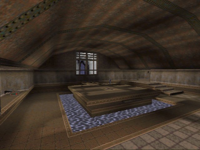
At first I
thought there was little too much water. Maybe there is, but I still had
great laugh playing this map. The layout is very open and wide. Something
which is not shown in the screenies are the long corridors which have upper
platforms on either site. I loved running down this. It gave you a height
advantage over anyone in the middle section. It was also entertaining if
a player was on the platform opposite you. You'd be strafing left and right
dodging their oncoming arsenal, whilst trying to put a big dent in them.
I think the
4 on 4 player load works the best here. 6 on 6 makes it a little more interesting.
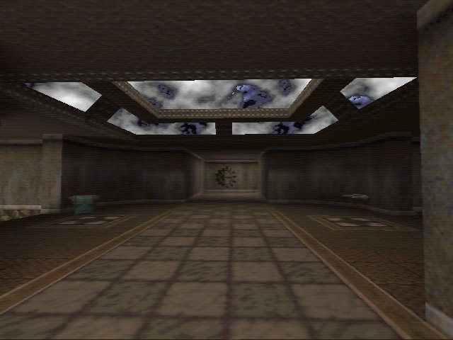
Theres a couple
 of wooden bridges, one of which can be seen in the third screenshot. I
love running up on these then just as you reach the top, jumping. I'd fly
high up into the air, enough infact so I could spin round in mid-air and
rip a couple of 'nades or rockets at a following opponent. However I did
happen to frag a couple of teammates when I did it one time. Doh!
of wooden bridges, one of which can be seen in the third screenshot. I
love running up on these then just as you reach the top, jumping. I'd fly
high up into the air, enough infact so I could spin round in mid-air and
rip a couple of 'nades or rockets at a following opponent. However I did
happen to frag a couple of teammates when I did it one time. Doh!
Naturally I
found some things that bug me =). First off the opening to the underground
water areas. In some places they are were in the middle of corridors. If
you were fighting you could easily fall in. That said, the majority of
the waterholes were very well placed. They were in the garden bits, as
Aard calls them, or off to the side of corridors. The garden areas are
pretty cool. They help to break up the style of map.
Again I have
a little niggle with some of the architecture. There some really cool curved
metal roofs which are used (Pingu has them in his map as well). Then theres
those very thin, weak looking metal supports. I personally would really
have liked the roofs to all be curved. I just think that style looks better.
Paul
 News
News
 Reviews
 Comments
 Articles
 Archives
 Search
 Top 10s
 Site
Site


![[Get Opera!]](banner_speedfun.gif)