|
|
|
|
|
Rapdm3: InterFearance
(2 to 4)
|
 (14) (14)

|
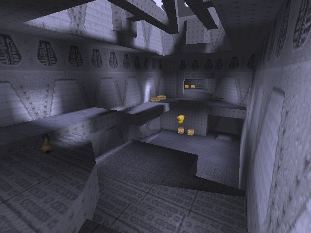
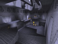 Cluttered and cramped is the unfortunate first impression you get. Oh and its very, very blue. Every texture is shaded blue, which does make items really stand out. Unfortunately the scale of the map is all to pot, some areas almost get it right where as others are infuriatingly small. You end up bashing walls and get the feeling the ceiling is right on top of you.
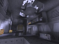 However, Raptore shows promise with the inclusion of a couple of nice touches such as the bobbing crates in the maps only water section and the underwater tunnel, with shimmering windows. Whilst these effects help raise the level a little, it doesnt do enough. There are odd things that dont make any sense, like why the first time you walk over a player spawn it says -1 and the mysterious floating YA. Elements like this make the level feel more like a test map than anything else.
And I hate to say it but it doesnt get any better whilst playing. There is more than enough supply of weapons, ammo, health, etc, but movement is so cumbersome that its depressing. If the scale were expanded and a little more care taken with texture alignment then it could have been more that just a novelty.
Paul
|
|
|
#1
Hmmm....
by
xen
27/01/2002 - 12:55:00 (194.117.133.196)
|
|
There's a map in the pending list called "Morbid Descending", which uses similar textures to these, except a bit dirtier. Do you know if they are based on this set or made from scratch? They're better, imo.
|
#2
texes
by
cyBeAr
27/01/2002 - 13:07:29 (213.64.67.243)
Refers to post #1
|
|
frmo the shots these look just like idbase made blue.. uhm suppose I don't help you much with the other set tho since I haven't looked at it.
|
#3
Well...
by
Paul
27/01/2002 - 13:47:27 (172.190.9.8)
Refers to post #1
|
|
I don't think the textures used in mvdm1 are a modified version of the ones in rapdm3, since mvdm1 was out 3 months before this map :).
|
#4
very good...
by
Jakuza
30/01/2002 - 02:28:20 (193.193.163.7)
|
|
I think that the map have very good textures and i like it in multiplayer
|
#5
Shuttup...
by
Drannerz
30/01/2002 - 10:32:51 (143.52.2.203)
|
|
...scrote
|
#6
/me faints
by
Raptore
02/02/2002 - 12:56:45 (66.69.174.58)
|
|
WOW!!!! you actually reviewed the map! omg omg omg I can't beleive it, and only seven months after it was released! wow, such a speedy response. =p on a more serious note, i've been waiting for this critical analysis for a long time. NOW i can make something based on suggested improvements from this review. Thanks.
|
#7
Sorry Raptore :)
by
Paul
03/02/2002 - 10:18:56 (172.190.117.48)
Refers to post #6
|
|
Please don't tell me you've been waiting this long before making another map.
Btw, did you get my email?
|
#8
critical analysis
by
Drannerz
03/02/2002 - 11:43:54 (143.52.28.10)
Refers to post #6
|
|
As Paul mentioned, it's too cramped. It's not just the small scale, though. There are angles and blocks that seem to stick out/up/down into the map causing obstacles for the player.
I can't see any clear examples of this in the screens, but there's an area that overlooks the water section where a block sticks down from the ceiling. The block is right where I want to stand when shooting and makes it difficult to take up this vantage point position quickly. When designing the areas I try to imagine routes or paths that the players will be using, and make sure the lines and geometry of the areas allows an easy flow of traffic along these paths.
The only other thing I didn't like was the colour scheme. All blue! I think this texture set needs to be used with other colours to provide contrast, otherwise it ends up looking bland.
Apart from that the map was quite good, weapon placement seemed sensible and if navigation and movement were less frustrating gameplay would have been quite fun.
This map would have been reviewed ages ago at RQ, but a combination of work, laziness and site re-design interferred.
Map on!
|
#9
Muhaha!
by
raptorE
03/02/2002 - 14:35:38 (66.69.174.58)
|
|
Actually I have attempted several maps, the failures of which you can see evidence of in the unannounced section of my site entitled miscelanious junk.
http://www.planetquake.com/raptore/mapping_index.asp <--this should get you on your way.
Still, rapdm3 was a large stepping stone in my road to efficient mapping, as I was still learning. Responce from that map was a critical point in my learning, and any mistakes I MIGHT have made in that map would have gone without correction to further plague my future designs.
About the E-mail, I did not get it. See, back in June when I submitted the map for review here, I had a different E-mail. I haven't been able to find the part of this site where you update your account, but MOST of the information on mine is now innacurate. My new website is www.planetquake.com/raptore and my new e-mail is [email protected]... the slippery or whatever mail that's there now no longer works. I HAD wondered why no one told me it had been reviewed, since I hadn't know until a week afterward when my brother mentioned it by chance. You probably sent it to the expired E-mail. That's all
|
#10
Ahh
by
Paul
04/02/2002 - 16:13:45 (172.189.255.198)
Refers to post #9
|
|
I sent an email to [email protected]. All it was was to apologise for the errr.. delay and tell you the review was up :).
|
#11
Re : critical analysis
by
Paul
04/02/2002 - 18:02:23 (172.189.255.198)
Refers to post #8
|
|
I know what you mean by that block that juts out, dunno why I didn't mention it specifically because I did hit it quite a few times :).
|
#12
Gaahh
by
raptorE
05/02/2002 - 14:22:15 (66.69.174.58)
Refers to post #10
|
|
Great, now you make me feel guilty for giving you such a hard time. I'm going to go look for the block now, and when I find it I will hit my head on it a couple of times for good measure. My next map will have *much* better clearance, I promise. I've come a long way since june. >=)
|
#13
Nevermind :)
by
Paul
05/02/2002 - 19:05:07 (172.178.18.190)
Refers to post #12
|
|
I look forward to what you've got in the works.
|
#14
raptorE!
by
Speeds
12/02/2002 - 22:51:38 (80.70.224.153)
|
|
You`v shown this map beta to some ppl, including me (when it was stock id-base textured) and you`ve been told its cramped.
Shame you didnt listen at all!
I like the set looks and some ideas but the map is crewed by the scale/clipping ;(
|
|
|
 News
News
 Reviews
 Articles
 Archives
 Search
 Top 10s
 Site
Site


![[Get Opera!]](banner_speedfun.gif)