|
|
|
|
|
Eternal6
(1on1 - 4FFA)
|
 (5) (5)

|
 From the readme:
After a mapping break of more then 2 years, heres my lousy add to the q1 world where everything is fucking aimed at details now...
From the readme:
After a mapping break of more then 2 years, heres my lousy add to the q1 world where everything is fucking aimed at details now...
Nice intro. cOlds aim was to create something that played well and wasnt interested in making it look to flashy. Well he succeeded on the latter part. It doesnt quite cut the mustard for me on the first point.
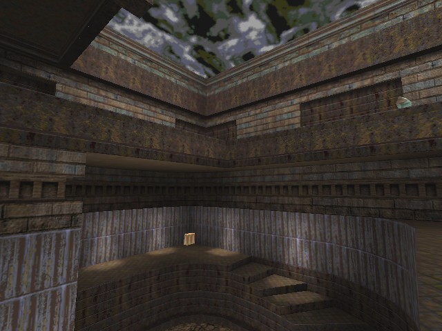
The layout consists of 3 very similar 3-floored atriums that attach together in a Y shape. The ground and 1st floors connect fairly well with staircases, but the top floor requires teleporter access and as such is a little disjointed from the rest of the map. It just smacks of the damn I ran out of space for stairs so Ill stick a teleporter in type of mentality.
The selection of textures is interesting, with upper sections decorated in Kingpin brick and lower in mostly wizmet variant merged with rusted metal beams. The two themes do sort of go together, but the problem is that given the 3 atriums look very similar in terms of layout and how they look, its hard to pick out where you are. Even after playing for a while it was still difficult. Some visual pointers wouldnt have gone amiss. Regardless of what c0ld says there is some detailing. The upper sections have unfinished brickwork, with some sections looking random, whilst others have strangely rectangular sections missing.
Item placement also lacks thought and I found myself wall hugging a lot since most items were placed in corners or up against walls. There is no real pattern to weapon placement and with no obvious item pad it is hard to pick them out at first. Which is a pity since the map is more than capable of holding 4.
Its quite an enjoyable map once/if you grasp the layout and random item placement.
Paul
|
|
|
#1
phfthirst post
by
Drannerz
06/02/2002 - 06:56:31 (143.52.28.10)
|
|
I "bah" this minimalist approach.
|
#2
Yoink!
by
DaZ
07/02/2002 - 07:37:08 (213.122.120.90)
|
|
In Unreal Tournament the minimalistic look is lovely, clean lines, subtle coolored lights and clean textures look really good and sterile, but in Quake I dont think it works that well at all, as Quake is set in a rusting, decayed kinda place.
While this map isn't stunninging in the looks department, they are functional to an extent, and the map plays ok in a 4 player FFA, but does get boring after a while.
With more detailed looks and better layout planning, this could have been really good...
|
#3
Hmmm
by
Paul
07/02/2002 - 08:48:08 (213.122.55.120)
Refers to post #2
|
|
I see what you're getting at but I can't remember a map that has gone for a proper minimalist look by using clean textures, i.e. ones that don't have much/if any detail to them. Thats the problem here, detailed textures have been used and there isn't really the architecture to back it up.
Interesting idea though, just to use sort of plain coloured textures. Kinda reminds me of that contest nunuk ran for q3a.
|
#4
Yeah Paul
by
DaZ
10/02/2002 - 20:16:52 (213.122.105.21)
|
|
and if any mappers out there feel like going for this "minimalistic" approach to mapping then grab "bulowad" - a cool texture set that looks great when used minimalisticly as well! You find it here : click u stupid arse!
|
#5
Bite me
by
[cOld]
13/02/2002 - 09:35:07 (213.237.17.163)
|
|
bwaha..
This was a layout I had lying on the hdd for what, a year? The design is very minimalistic, but I was basically trying to do something without worrying about looks. Not that I put much effort into it anywas, i'll do next.
/em goes off to play with his voodoo doll of Paul
|
|
|
 News
News
 Reviews
 Articles
 Archives
 Search
 Top 10s
 Site
Site


![[Get Opera!]](banner_speedfun.gif)