 Quake 3 Arena gothic style map with the monotonous bitty grey texture set. Not something that usually sets my pulse racing.
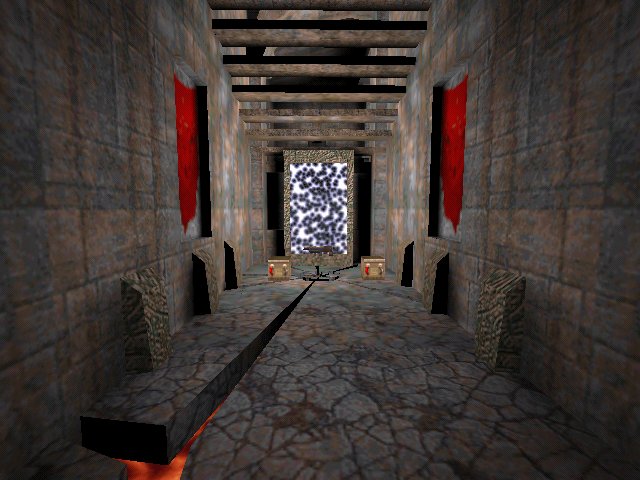
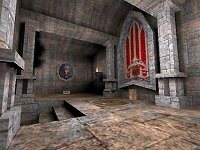
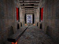
The first thing I noticed was that the scale could do with some work. Some areas err on the large side, where as others are the opposite. Parts of the architecture are also brittle and thin, but I suppose this is copying the q3a style properly. Locki, however, seems more than capable of sculpting brushes into interesting shapes. Good examples are the sockets that hold the wall torches and the cracked floor, underneath the LG, that has lava seeping through. Overall lighting is good and suitably moody.
 It tries to make up for its deficiencies in the looks department by being quite a brutal map to play. The reason for this is simple, its a fairly small map which is very rocket orientated. Ammo was not a problem and Id perhaps say there was too much. Some of the item placement could have been improved. The RA and GA are within a very short distance (making the GA frankly useless) and the same goes for a couple of the weapons.
Unfortunately there was no readme with the map, so Im unable to see how this map came about. Locki shows potential and I think if he/she (hedging my bets :P) took their skills and tried something a little more original then we may see some interesting work.
Paul

 News
News
 Reviews
 Comments
 Articles
 Archives
 Search
 Top 10s
 Site
Site


![[Get Opera!]](banner_speedfun.gif)