Circle Strafe
1 on 1 players | Reviewed by DaZ - Friday 09 February 2001 @ 04:05
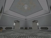 Ok, fullbright Un-vised box map time lads. What we have here is a classic "Should never have seen the light of day" type map. We all know the ones... At first glance I never noticed the gaping holes in the walls that lead out into the void, or the nasty custom textures, but I did notice the horribly fullbright lighting. My mind was telling me that the map was not lit OR vised at all but after a while of searching around (and finding more leaks) I eventually found what could be called "a shadow".
The layout comprised of a box in the middle of the map with a circular corridor running around it, this corridor is linked to the box in the middle via corridors every 90 degrees. The map is all on one level and thus no vertical fighting at all, the only way your going to get on top of your opponent on this map is to Rocket jump onto his head...
Combat is dull and uninterresting thanks to the lack of cov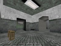 er, Z-axis support and lighting. Weapons and items seem to be just spread around for good measure with only the rocket launcher in the central area making any sense...
On a finishing note, some advice for the author. If you are going to release a map then make sure it is fully vis'ed and lighted BEFORE you upload it. Badly made / Un'vised maps run very poorly and generally show YOU up as a bad mapper... This map would have been greatly improved if there was more than one level to play on and lighting was much better.
![]()
0.5 out of 5.0
Download 157Kb | readme | Dale | http://homepages.go.com/homepages/s/u/l/sulseeker/
# 2. well, uhh ^
by mal - Friday 09 February 2001 @ 10:03
some of the textures were aligned, weren't they?
# 3. Now... ^
by Rotpig - Saturday 10 February 2001 @ 12:06
With a little more work here and there, this map wouldnt be so bad. Even tho the layout is TOTALLY symettrical, it does have something going for it. (half of Id Q3A maps are symettrical in nature, not that this is a good thing)
I noticed that when you play with bots, they almost ALWAYS get stuck in walls when they respawn which is VERY shite.
Sorry Daz but I just have to agree with you on this one :)
# 4. Yes, ok... I know it was bad. ^
by SulSeeker - Saturday 10 February 2001 @ 10:33
But this was a little map I constructed for a LAN party with some friends of mine. We actually had some fun with it, tho the gaps in the walls were due to the editor (Qoole 2.50.) As for the full bright, it was the lights were too bright, it was vis'ed.
Working harder tho, it's a learning experiment. I promise my next one WILL be better (alog with some sort of vertical fighting, I just don't have a good grasp of triggers... yet.)
# 5. Need a tester? ^
by Rotpig - Sunday 11 February 2001 @ 08:26
Sulseeker, if you need someone to thrash out your maps and help you tweak 'em, I'm your man.
Send me any maps you have at beta stage.
# 6. Same old story... ^
by XeNoN - Tuesday 13 February 2001 @ 05:29
"But this was a little map I constructed for a LAN party with some friends of mine. "
I've seen that excuse before, with "perpnrg" by Satanix. There's nowt wrong with making and uploading substandard maps for private use, but try making a decent one before you unleash it on Paul and da crew here at mpq.
# 7. respec' ^
by Drannerz - Wednesday 14 February 2001 @ 01:13
Damn right xenon...I hate the old "but it's just a little map I knocked together in a few minutes, it wasn't meant to be good" excuse
-Drannerz
# 8. Well... ^
by BlackPope - Wednesday 14 February 2001 @ 04:24
Well you can't get testy about someone releasing a map of pure shyte (no offense)to mpq, as the point is to review all QDM maps no matter the quality...It's a great way for learning mappers to gain input, ideas, and general help all around... er uh, where was I...If only top notch maps were reviewed at MPQ... we wouldn't need any rating system would we? Or it would be rated out of 2!
or like a cheesy western "Good , Bad, or Ugly"
:)
(I'm still alive, tho my cpu is fuxx0rd, I shall not be very active until I aquire my new one )
BP
# 9. Blackpope! :) ^
by Fern - Thursday 15 February 2001 @ 03:08
I thought of you when I played this map: It's not a f*cking box. It's not two f*cking boxes. It's five f*cking boxes.
# 11. Austin_Brock chickened out of the title writing ^
by Austin_Brock - Thursday 22 February 2001 @ 09:01
Wooooooo........ after reading this, I'm glad my map might have a fighting chance, I played this one and thought, my mum could do better (Ok, she couldn't), but still as a first attempt its not too bad, I suggest using Worldcraft. Mine is my first attempt so please go easy on me! :)
# 12. Ooops ^
by Austin_Brock - Thursday 22 February 2001 @ 09:01
sorry, clicked refresh, never knew that this would happen. :)
# 13. First attempt ^
by Fern - Thursday 22 February 2001 @ 10:00
My first attempt was a huge box with one fairly dim light in one of the corners and several hovering cubes of water, with no exits or items.
I didn't release it ;)
# 15. And for my next Project ^
by SulSeeker - Wednesday 28 February 2001 @ 03:23
OK, I should have the next map for you folks this week.
And I have a few optical illusions I thought ya'll will like... Which I haven't seen in any map before. It's just a one time... Woah... sorta thing... but I'll work.
Thanks for being so constructive, It HAS made me want to do ALOT better. and try alot harder in what I can create.
ZOT!!!!!!!!!!!!
# 16. Bad to worse ^
by Sven - Wednesday 26 September 2001 @ 04:12
Bad: Releasing a newbie map just made for your LAN buddies rather than waiting until you've refined your technique.
Worse: Chastizing the poor, upstart mapper for taking a big risk, putting his ego on the line and publishing his first work.
# 17. Hmmmm.... ^
by DaZ - Friday 22 February 2002 @ 07:12
"tho the gaps in the walls were due to the editor"
So how the hell did it vis?
